[PT]
Desafio
Besito nasceu do desejo de criar uma marca de moda feminina que fosse, acima de tudo, sensorial. Uma marca que não gritasse, mas que marcasse pela leveza. O desafio era traduzir essa intenção em uma identidade visual com forte poder de presença, mas sem recorrer a recursos óbvios ou exagerados. A marca precisava comunicar sofisticação sem parecer distante, juventude sem perder maturidade, e feminilidade sem cair em estereótipos.
Além disso, havia uma dualidade a ser resolvida: como posicionar uma marca com atributos de luxo — como acabamentos premium, direção artística refinada e minimalismo visual — sem torná-la inacessível? Como transmitir a ideia de um "toque" em vez de um impacto visual? O objetivo era criar um sistema de identidade que equilibrasse emoção e racionalidade, construindo uma marca que conectasse através do detalhe, do gesto, da sensação.
Além disso, havia uma dualidade a ser resolvida: como posicionar uma marca com atributos de luxo — como acabamentos premium, direção artística refinada e minimalismo visual — sem torná-la inacessível? Como transmitir a ideia de um "toque" em vez de um impacto visual? O objetivo era criar um sistema de identidade que equilibrasse emoção e racionalidade, construindo uma marca que conectasse através do detalhe, do gesto, da sensação.
Conceito
"O gesto sutil que permanece.”
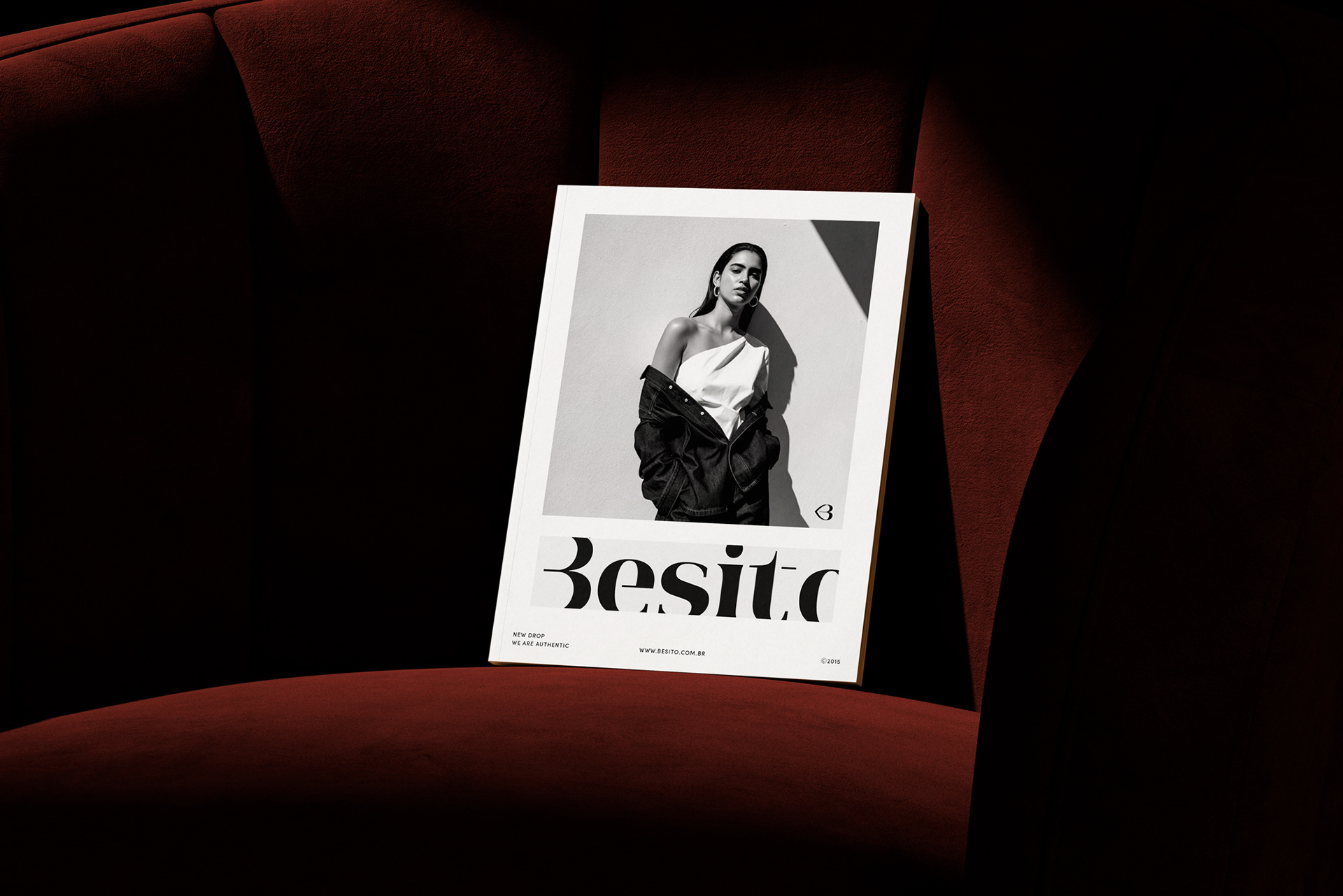
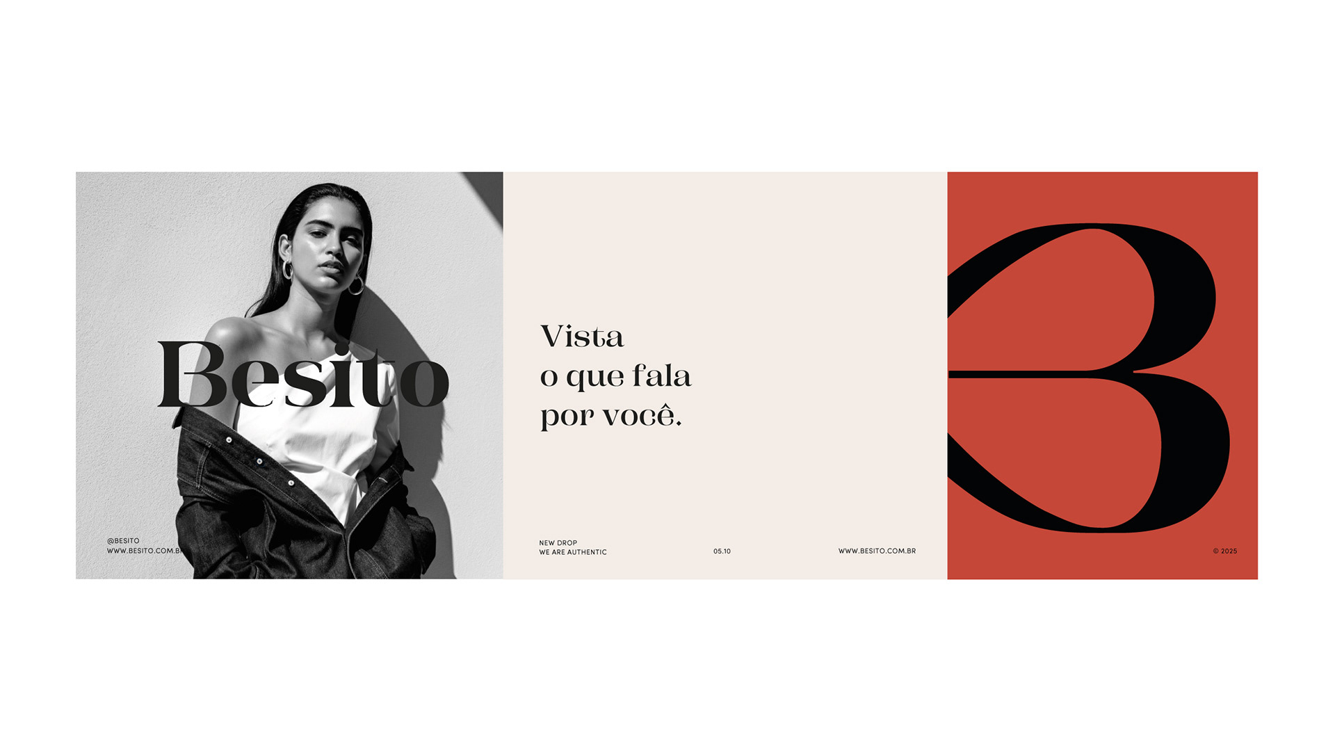
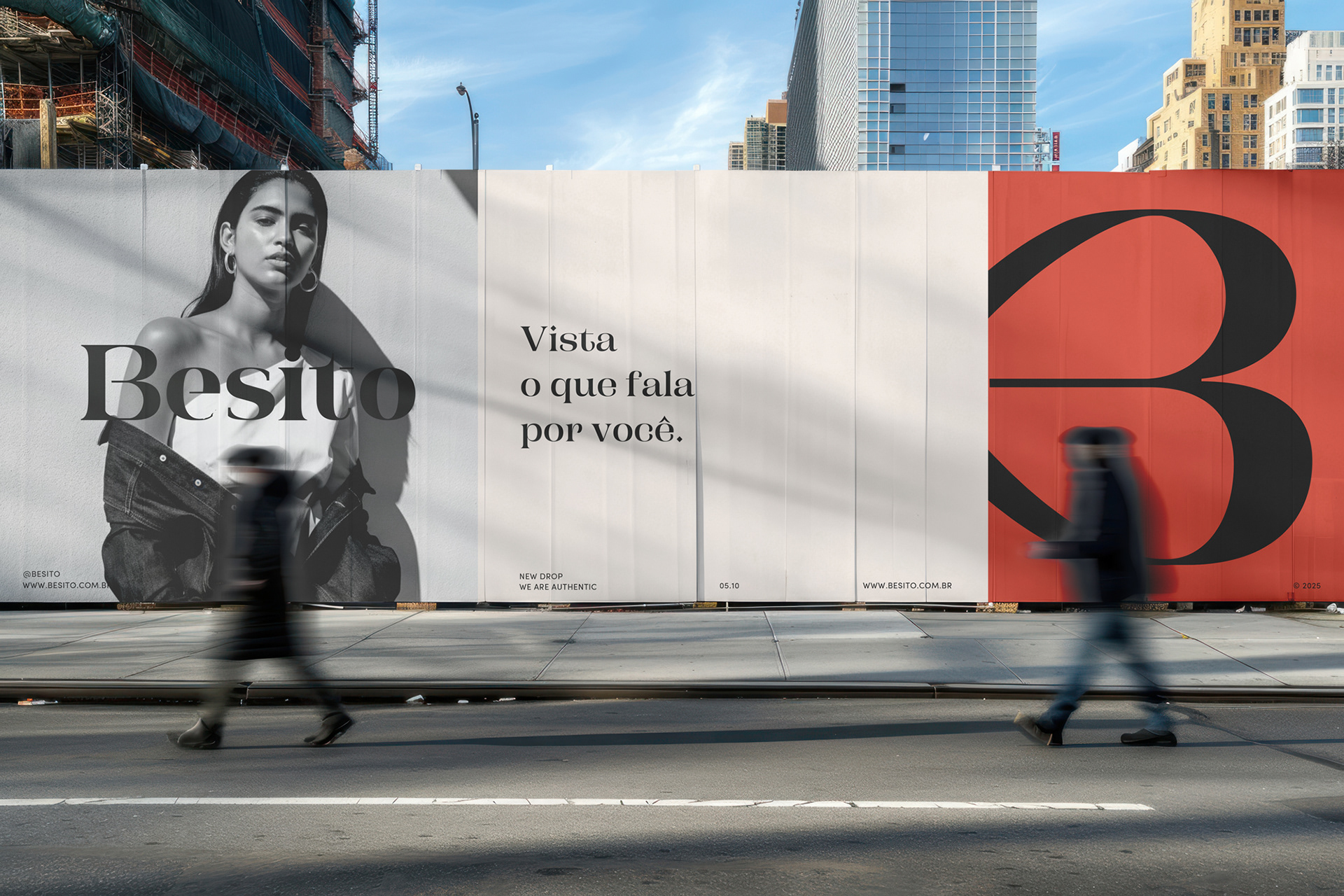
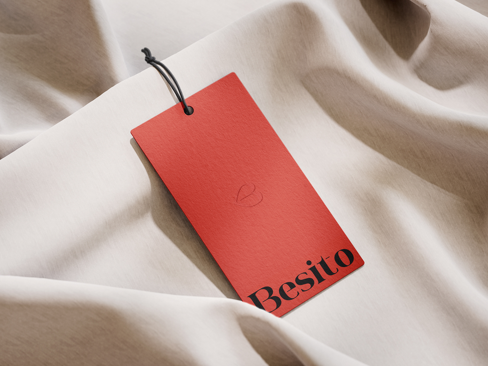
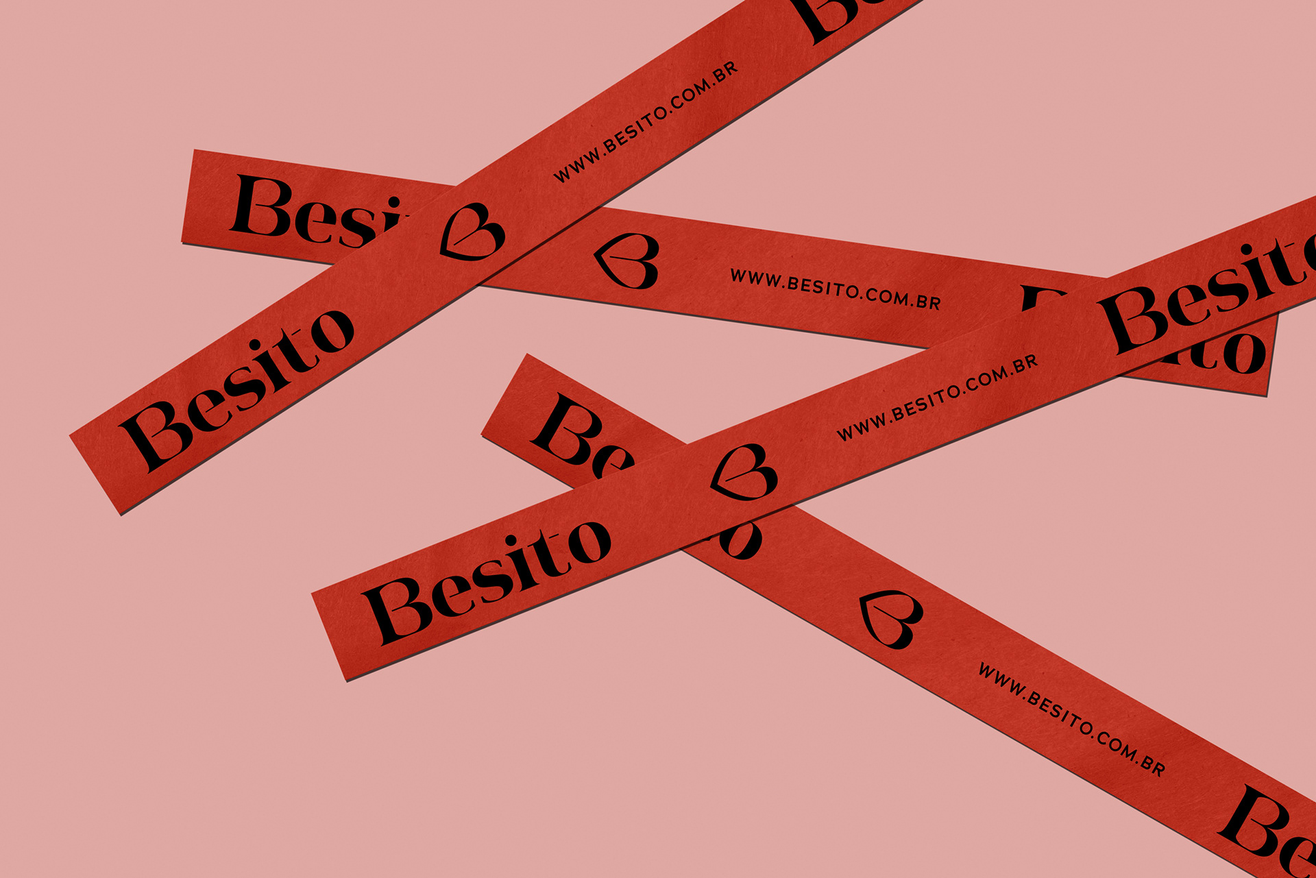
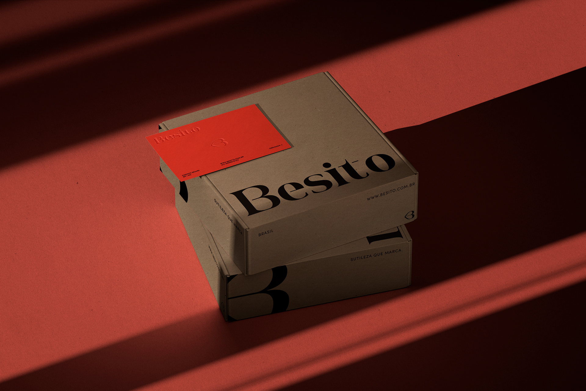
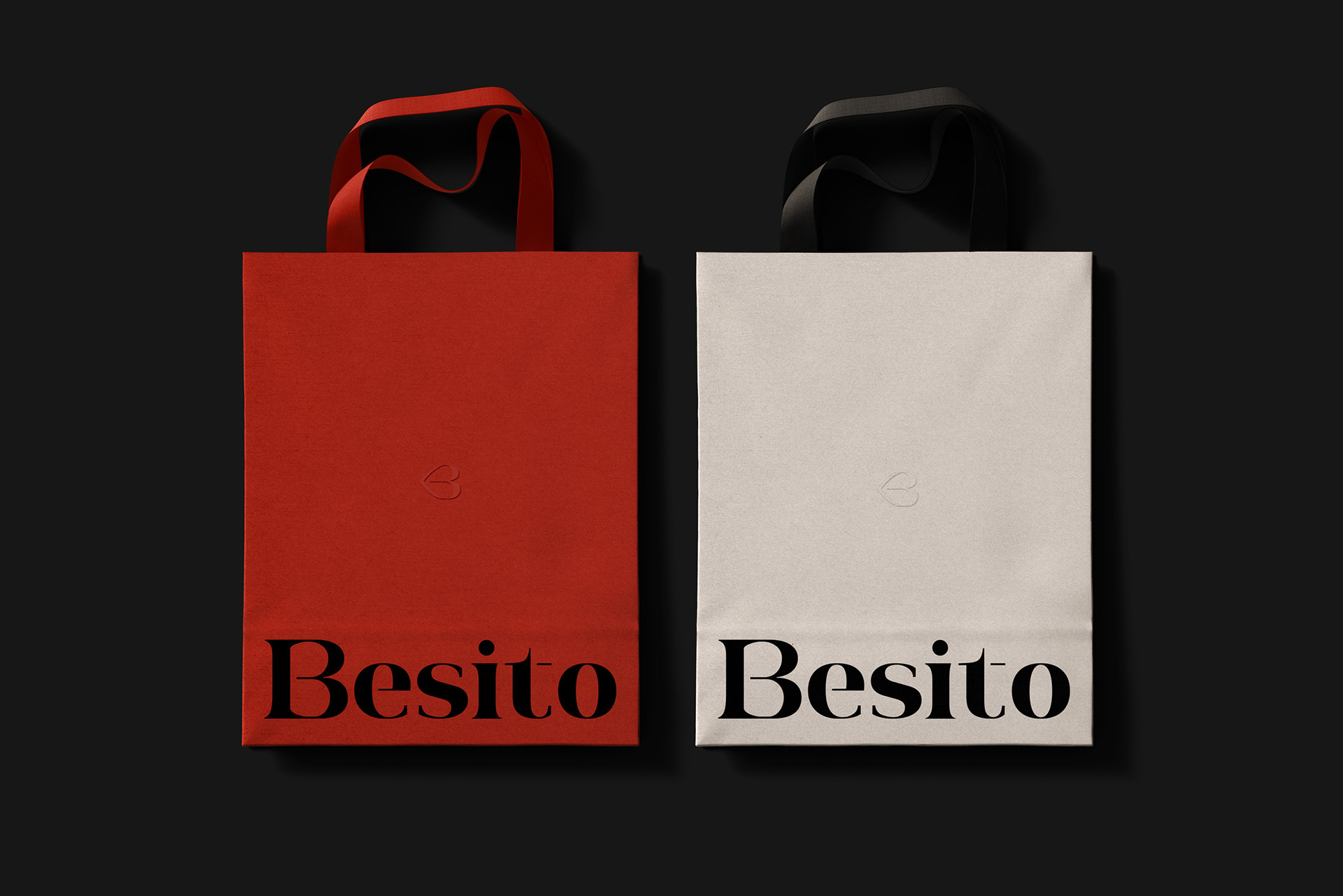
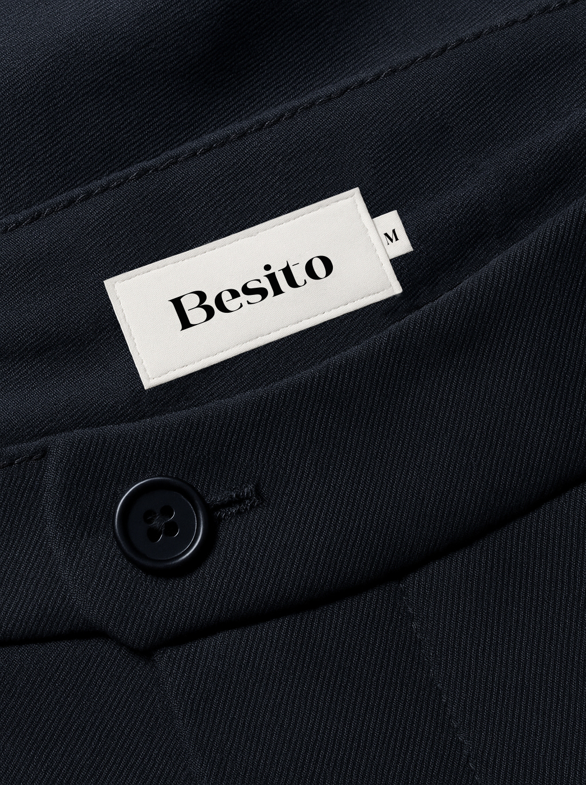
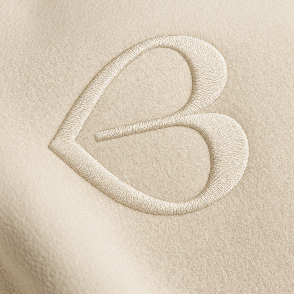
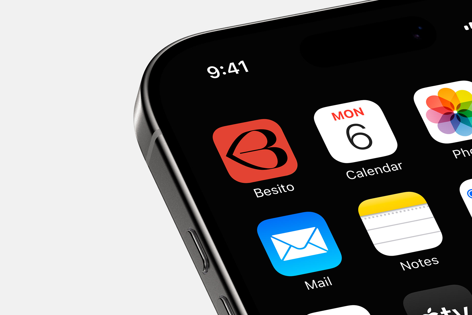
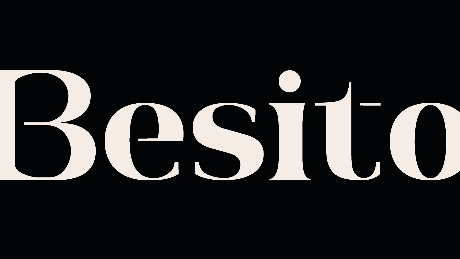
A identidade visual da Besito nasce da abstração da letra B, que ganha curvas e estrutura para formar um símbolo que remete à silhueta de uma boca — representando o beijo que dá nome à marca. Esse símbolo não busca ser óbvio, mas memorável, exatamente como a marca deseja ser sentida.
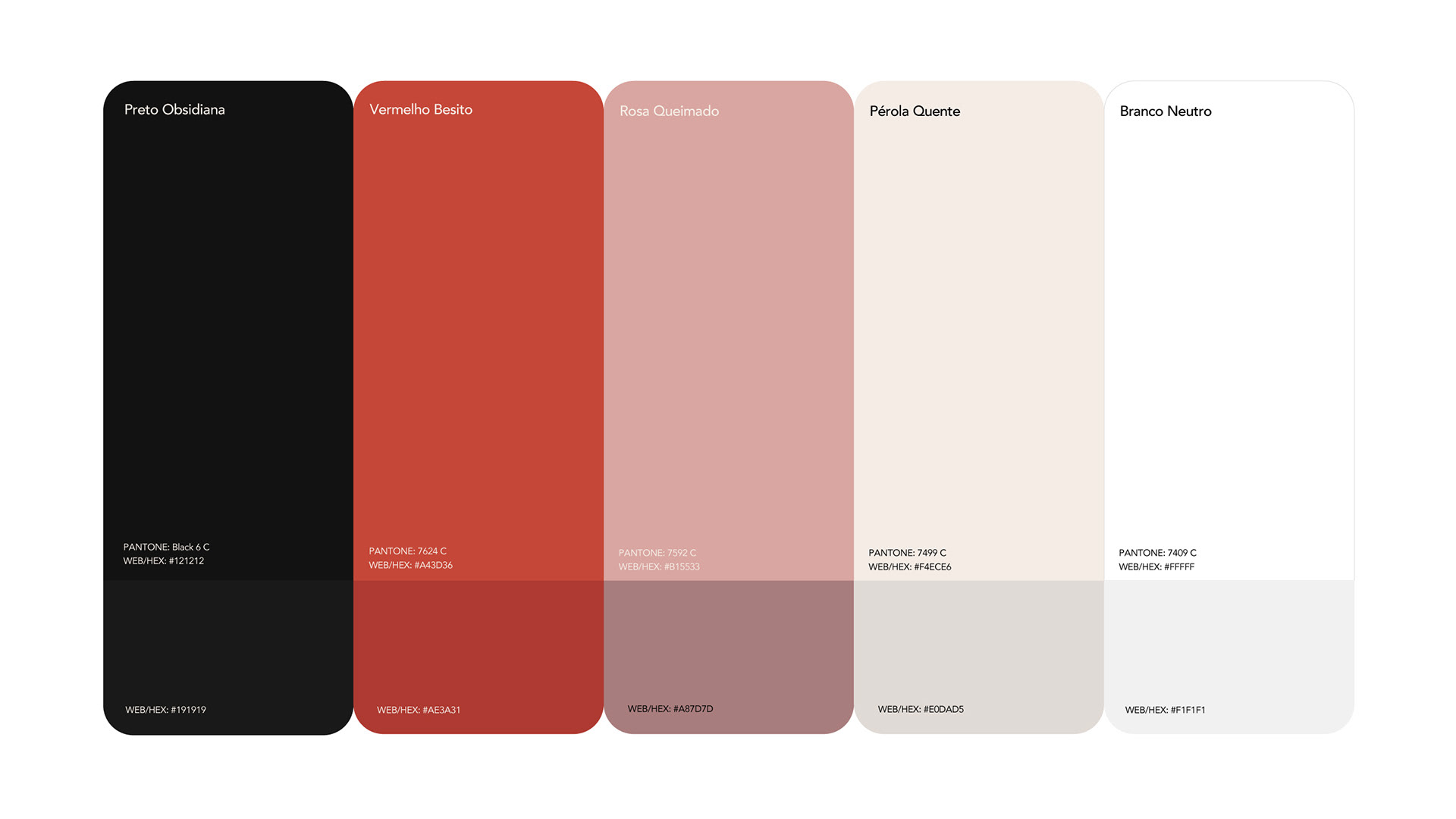
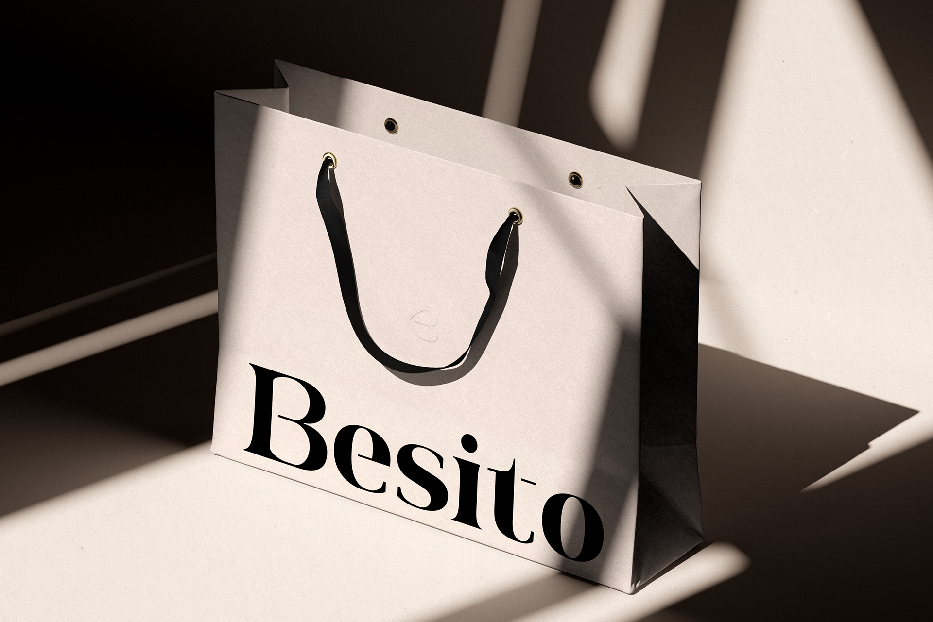
Toda a construção se apoia em contrastes delicados: a força do preto e do vermelho queimado dialoga com a suavidade do off-white e do rosa. A tipografia mistura presença e fluidez, e os espaços vazios se tornam parte da linguagem visual.
Mais do que uma estética, Besito é um gesto emocional. Um beijo silencioso, sofisticado e atemporal.
A identidade visual da Besito nasce da abstração da letra B, que ganha curvas e estrutura para formar um símbolo que remete à silhueta de uma boca — representando o beijo que dá nome à marca. Esse símbolo não busca ser óbvio, mas memorável, exatamente como a marca deseja ser sentida.
Toda a construção se apoia em contrastes delicados: a força do preto e do vermelho queimado dialoga com a suavidade do off-white e do rosa. A tipografia mistura presença e fluidez, e os espaços vazios se tornam parte da linguagem visual.
Mais do que uma estética, Besito é um gesto emocional. Um beijo silencioso, sofisticado e atemporal.
Serviços | Estratégia de marca e identidade visual.
_____
[EN]
ChallengeBesito was born out of the desire to create a women's fashion brand that was, above all, sensorial. A brand that didn't shout, but made its mark through its lightness. The challenge was to translate this intention into a visual identity with a strong presence, but without resorting to obvious or exaggerated resources. The brand needed to communicate sophistication without seeming distant, youth without losing maturity, and femininity without falling into stereotypes.
In addition, there was a duality to be resolved: how to position a brand with luxury attributes - such as premium finishes, refined artistic direction and visual minimalism - without making it inaccessible? How to convey the idea of a “touch” rather than a visual impact? The aim was to create an identity system that balanced emotion and rationality, building a brand that connected through detail, gesture and sensation.
In addition, there was a duality to be resolved: how to position a brand with luxury attributes - such as premium finishes, refined artistic direction and visual minimalism - without making it inaccessible? How to convey the idea of a “touch” rather than a visual impact? The aim was to create an identity system that balanced emotion and rationality, building a brand that connected through detail, gesture and sensation.
Concept
“The subtle gesture that remains”.
Besito's visual identity is born from the abstraction of the letter B, which gains curves and structure to form a symbol that refers to the silhouette of a mouth - representing the kiss that gives the brand its name. This symbol is not intended to be obvious, but rather memorable, exactly how the brand wants to be felt. The entire construction is based on delicate contrasts: the strength of black and burnt red dialogues with the softness of off-white and pink. The typography mixes presence and fluidity, and the empty spaces become part of the visual line.
Besito's visual identity is born from the abstraction of the letter B, which gains curves and structure to form a symbol that refers to the silhouette of a mouth - representing the kiss that gives the brand its name. This symbol is not intended to be obvious, but rather memorable, exactly how the brand wants to be felt. The entire construction is based on delicate contrasts: the strength of black and burnt red dialogues with the softness of off-white and pink. The typography mixes presence and fluidity, and the empty spaces become part of the visual line.
Services | Branding and visual ididity.
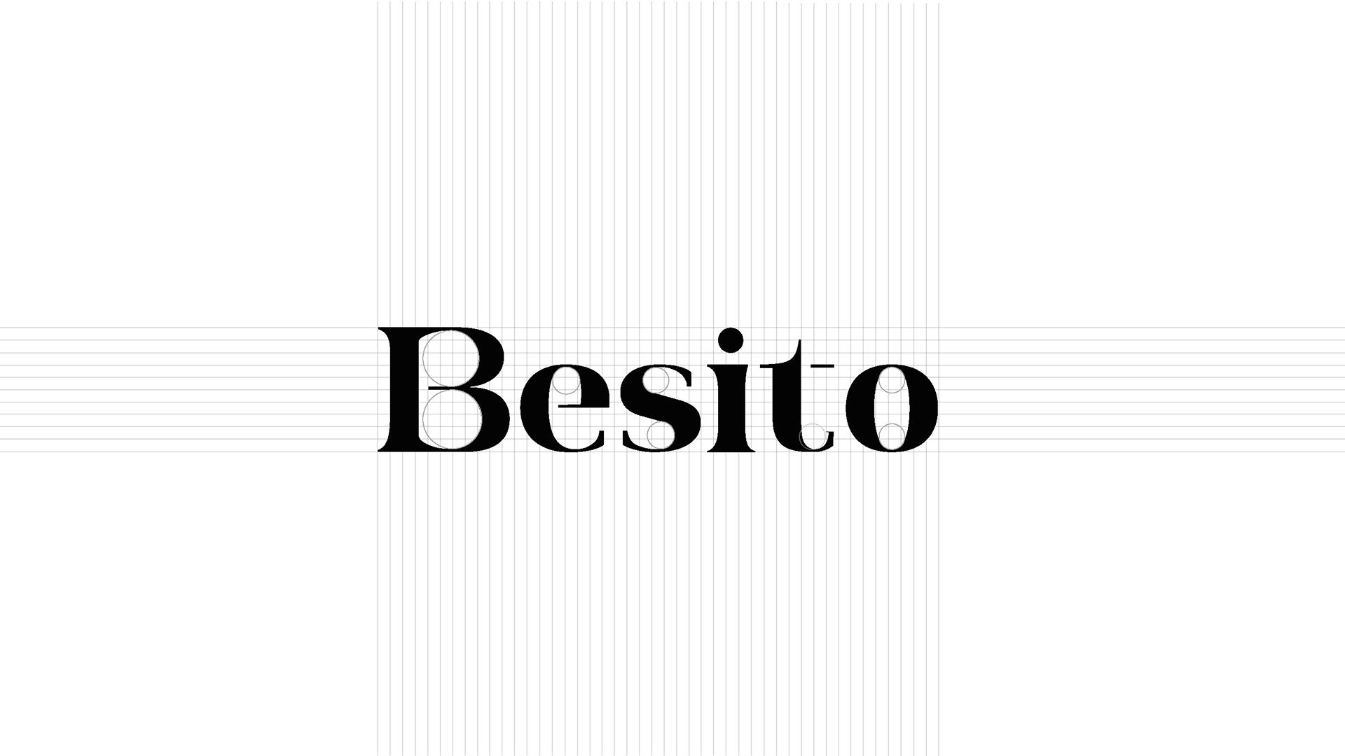
A tipografia principal foi desenhada para comunicar a essência Besito com firmeza e suavidade. Letras em caixa baixa, com curvas suaves e detalhes refinados, reforçam a acessibilidade da marca e a presença da feminilidade sutil, sem deixar de ser sofisticada e moderna.
The main typeface was designed to communicate the Besito essence firmly and smoothly. Lowercase letters, with soft curves and refined details, reinforce the brand's accessibility and the presence of subtle femininity, while remaining sophisticated and modern.